WŁOCŁAWEK
Włocławek is one of the oldest cities in Poland. Despite its strong roots and long traditions, it is still developing and aspiring to build a strong brand throughout the country.
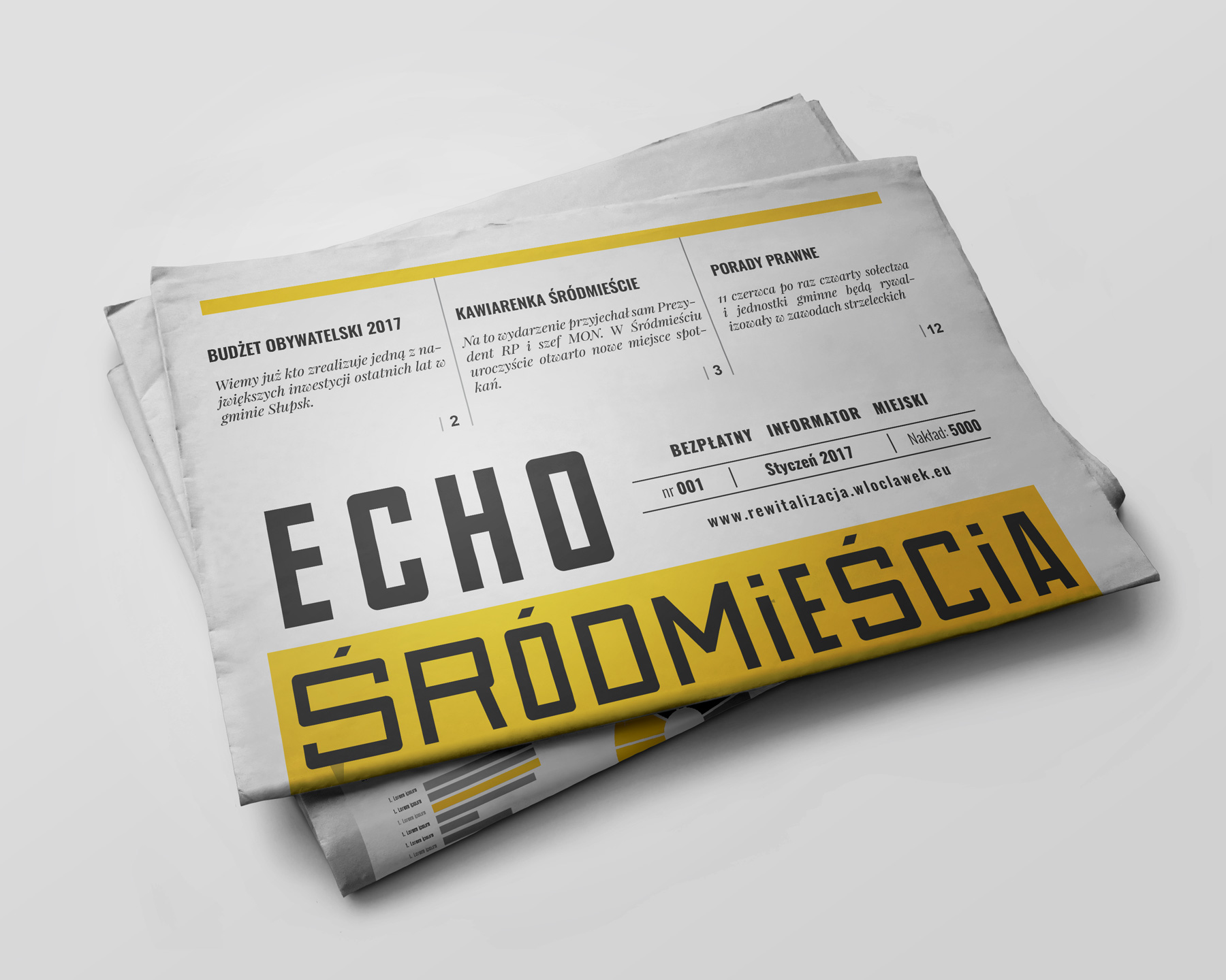
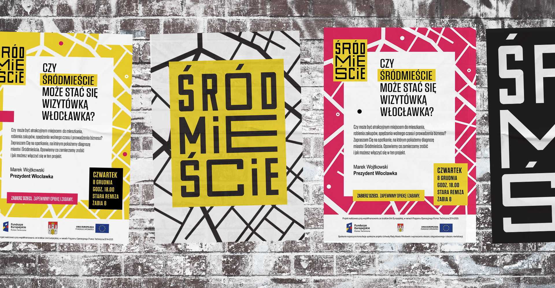
One of the most significant steps was starting the process of revitalising the Śródmieście district, whose aim is to bring the neglected part of the city back to life. To make it more resident-friendly, it was necessary to introduce a range of economic, social and image changes. The logo we have created refers to the dual nature of revitalisation. On the one hand, this process is precisely defined. On the other hand, it can assume various forms as well as undergo constant and dynamic transformations.
That is the reason why the basic frame of the logo remains unchanged, while the central part can be modified. The essence of revitalisation is space as an area “filled” with functionally connected objects and as a collective of people inhabiting it. These people constantly form social relationships and pursue various activities. The logo, much the same as the process itself, has a defined outer form, but the inner part has been designed so that it could be created with the residents. Since its very beginning, the revitalisation, thanks to its strictly defined visual identity, has been able to convey a clear, comprehensible and consistent message to its target beneficiaries.
We would like to thank Piotr Wielgus and Paweł Kołacz from PZR for their collaboration and sharing their professional knowledge.


back
top
Struggling with a brief?
Are there big challenges ahead for your organization? We can help you.
Talk to us.
Are there big challenges ahead for your organization? We can help you.
Talk to us.

+48 59 307 00 06
biuro@riocreativo.pl
biuro@riocreativo.pl
Rio Creativo Sp. z o.o.
Mickiewicza 26/2
76-200 Słupsk
Mickiewicza 26/2
76-200 Słupsk
#TeamRio
#SłupskaRobota
#SłupskaRobota
Rio Creativo © 2021

