
GMINA POTĘGOWO
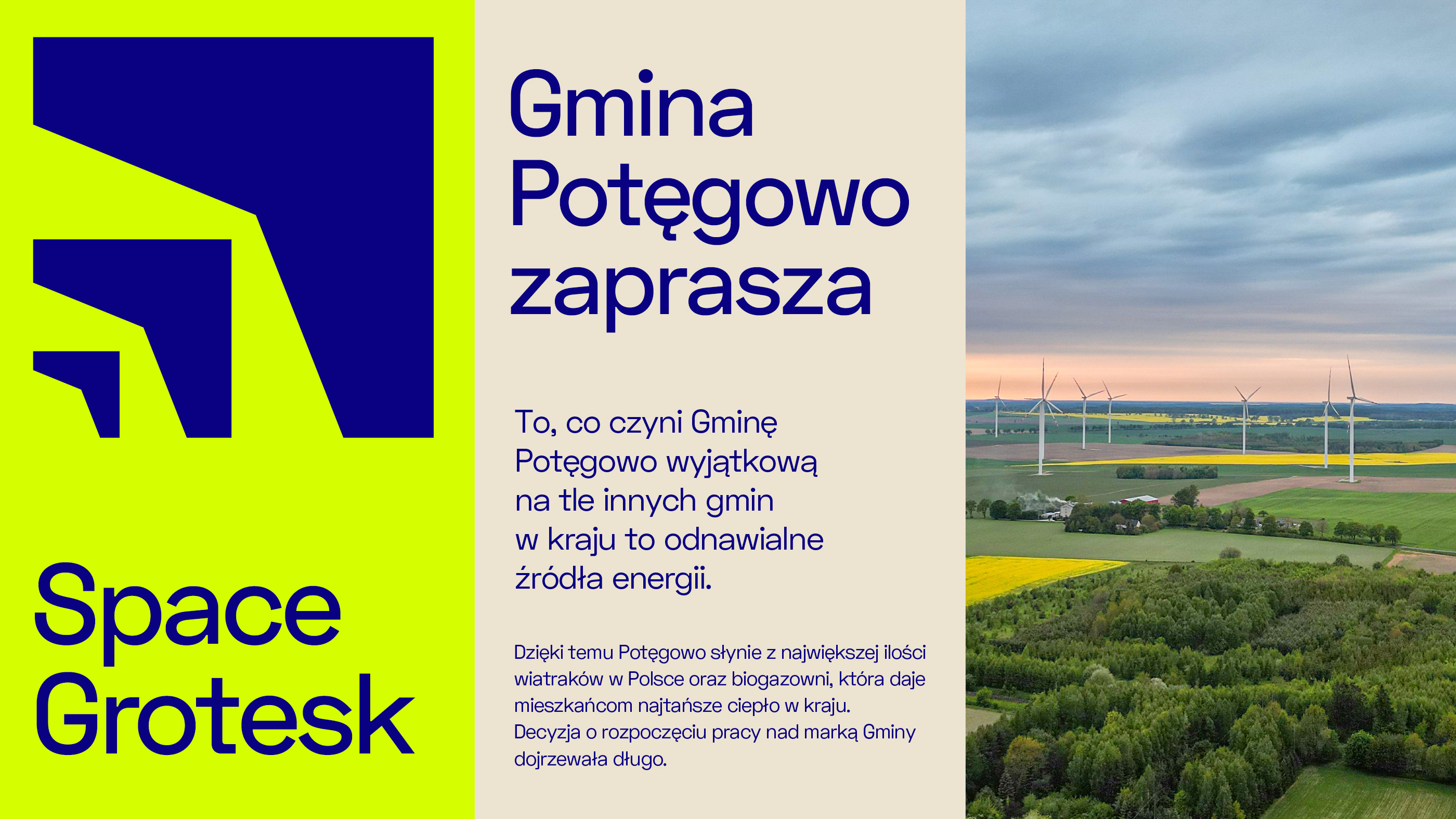
What makes the Municipality of Potęgowo unique compared to other municipalities in the country is its use of renewable energy sources. For many years, the authorities have been consistently investing in their development and are open to initiatives in this area. Thanks to this, Potęgowo is famous for having the largest amount of electricity generated from RES in Poland, as well as a biogas plant that gives residents the cheapest heat in the country.
The decision to begin work on the Municipality's brand took a long time to mature. It took several years to make sure that the path taken was the right one, and the accumulated assets were unquestionable in the communication.
The first step in the process of creating a new brand was a deep understanding of the Municipality's distinctive features and values. In-depth interviews, as well as strategic workshops that involved not only the authorities, but also representatives of business, and municipal institutions, made sure that this was a place with a keen awareness of the potential it wanted to communicate. After all, Potęgowo is the Power of Possibilities.
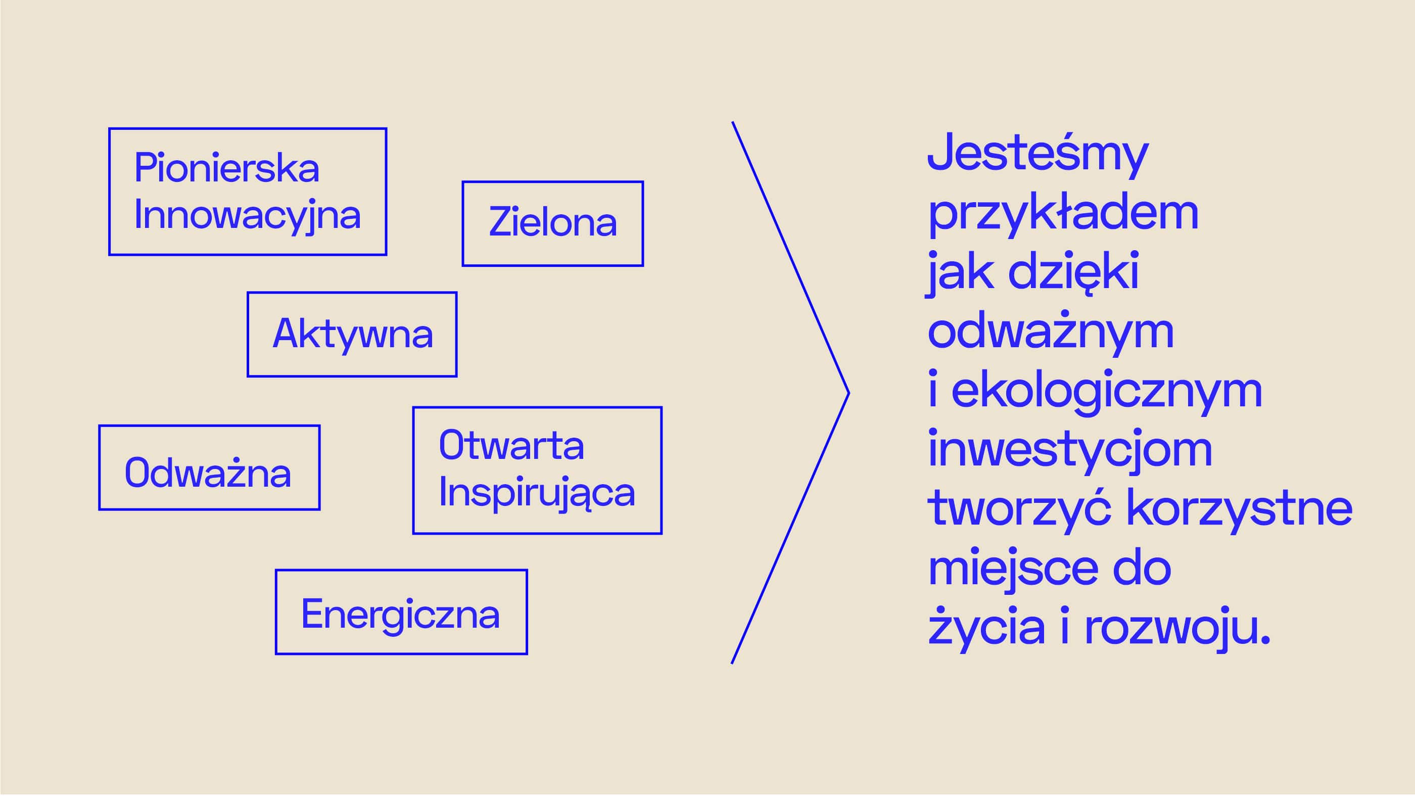
The new strategy underlines what has been in Potęgowo's DNA for many years - it is a pioneering, innovative and bold, but also an open, inspiring and supportive municipality. These distinguishing characteristics operate on many levels and are evident in all initiatives. The energy that not only the authorities, but also residents and investors have is contagious. The essence of the brand shows that Potęgowo is an example of how to create the best place to live and develop through bold and ecological investments.
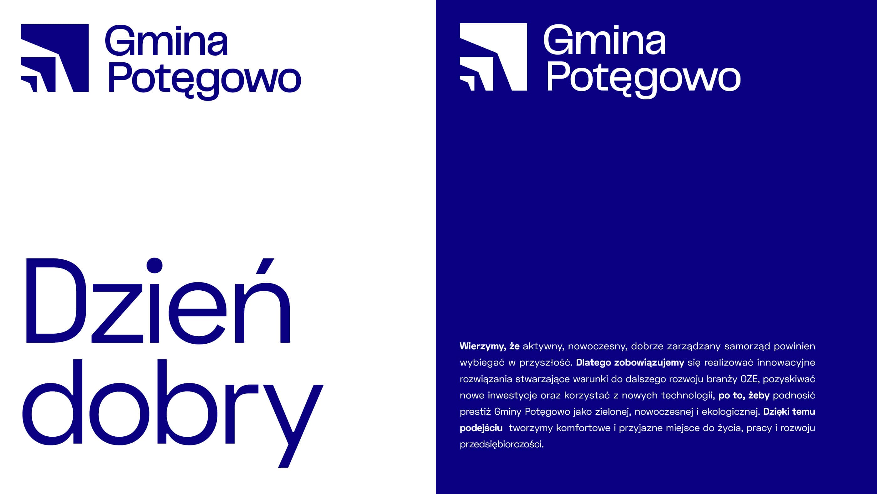
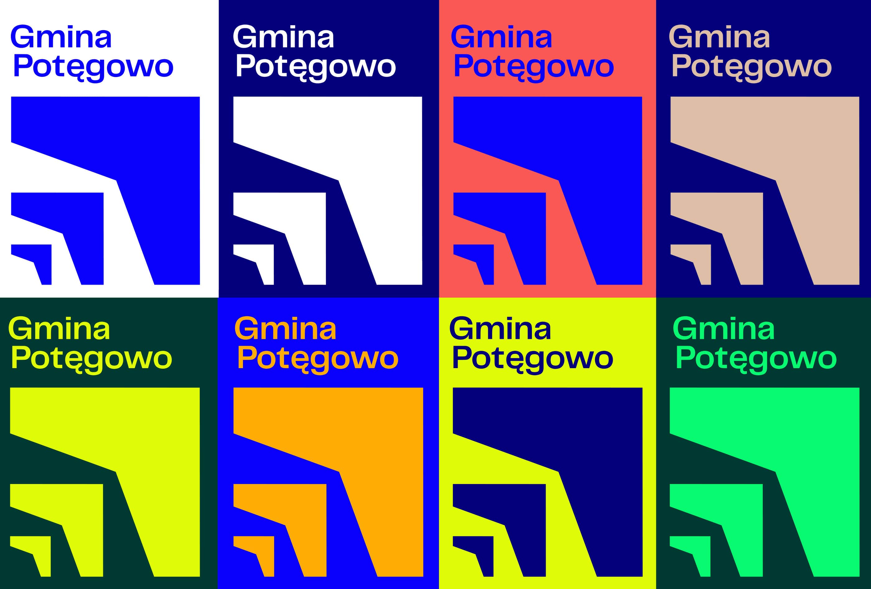
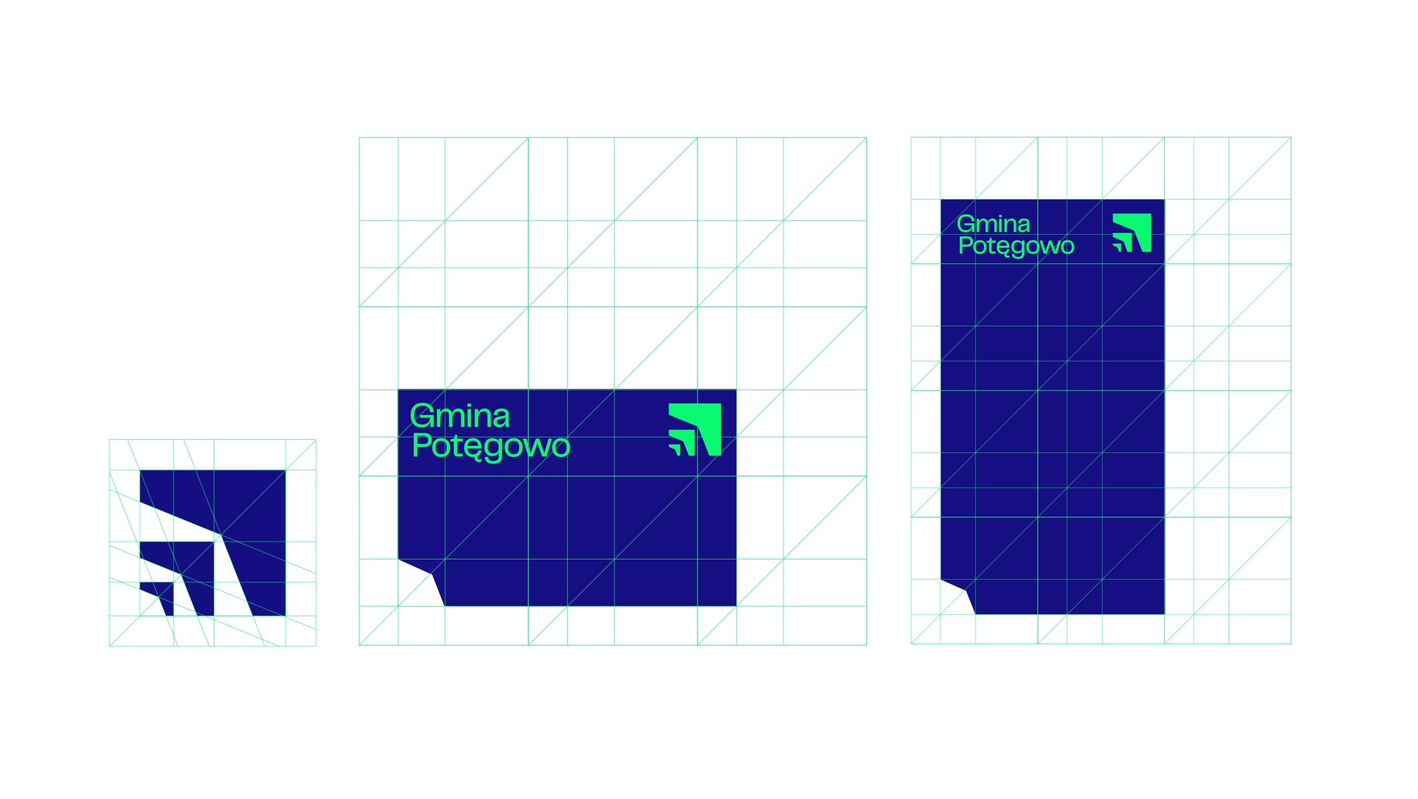
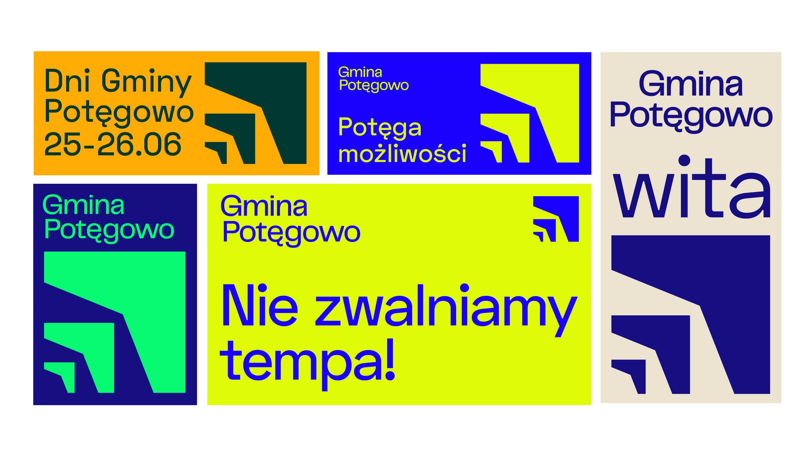
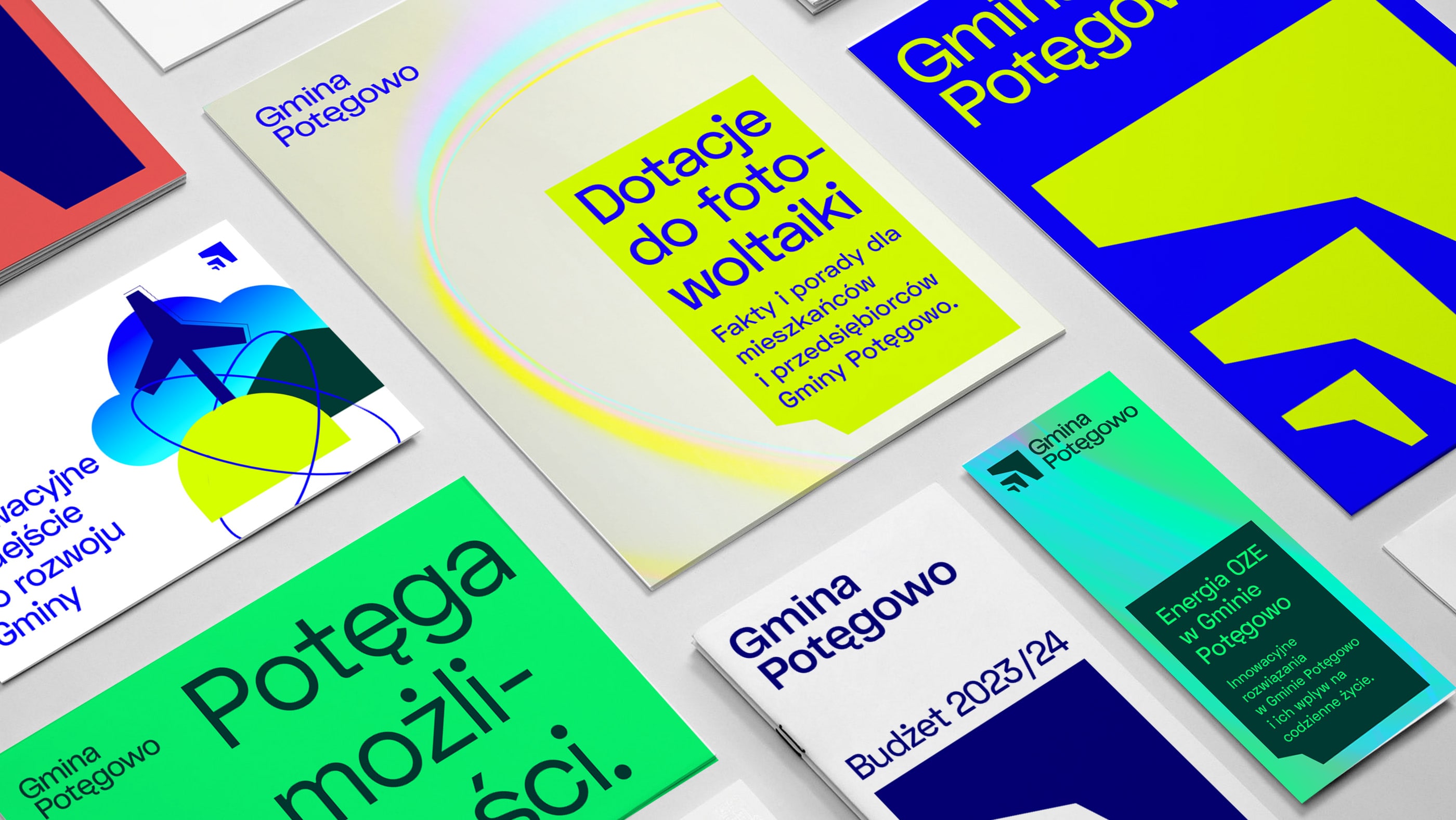
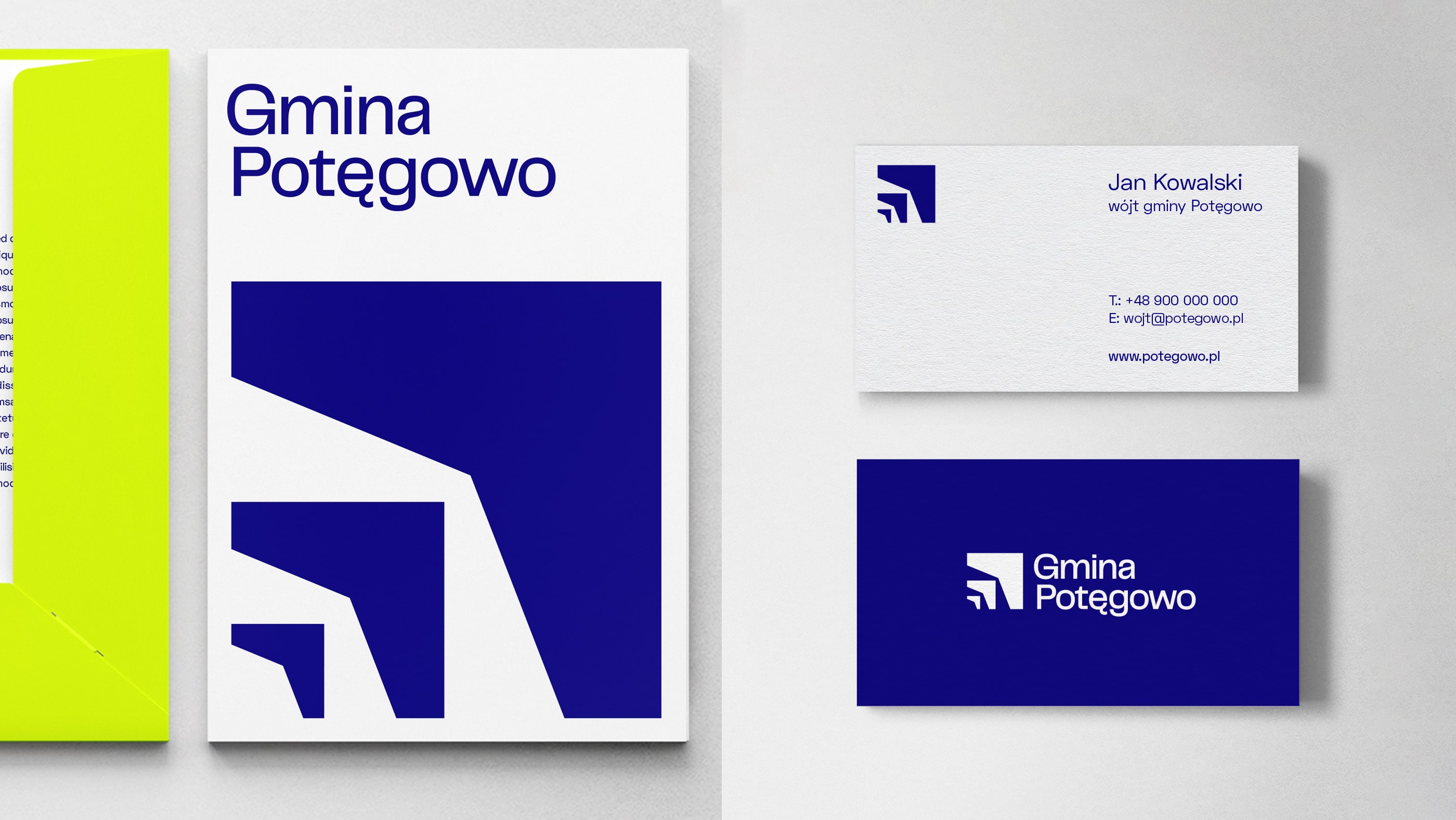
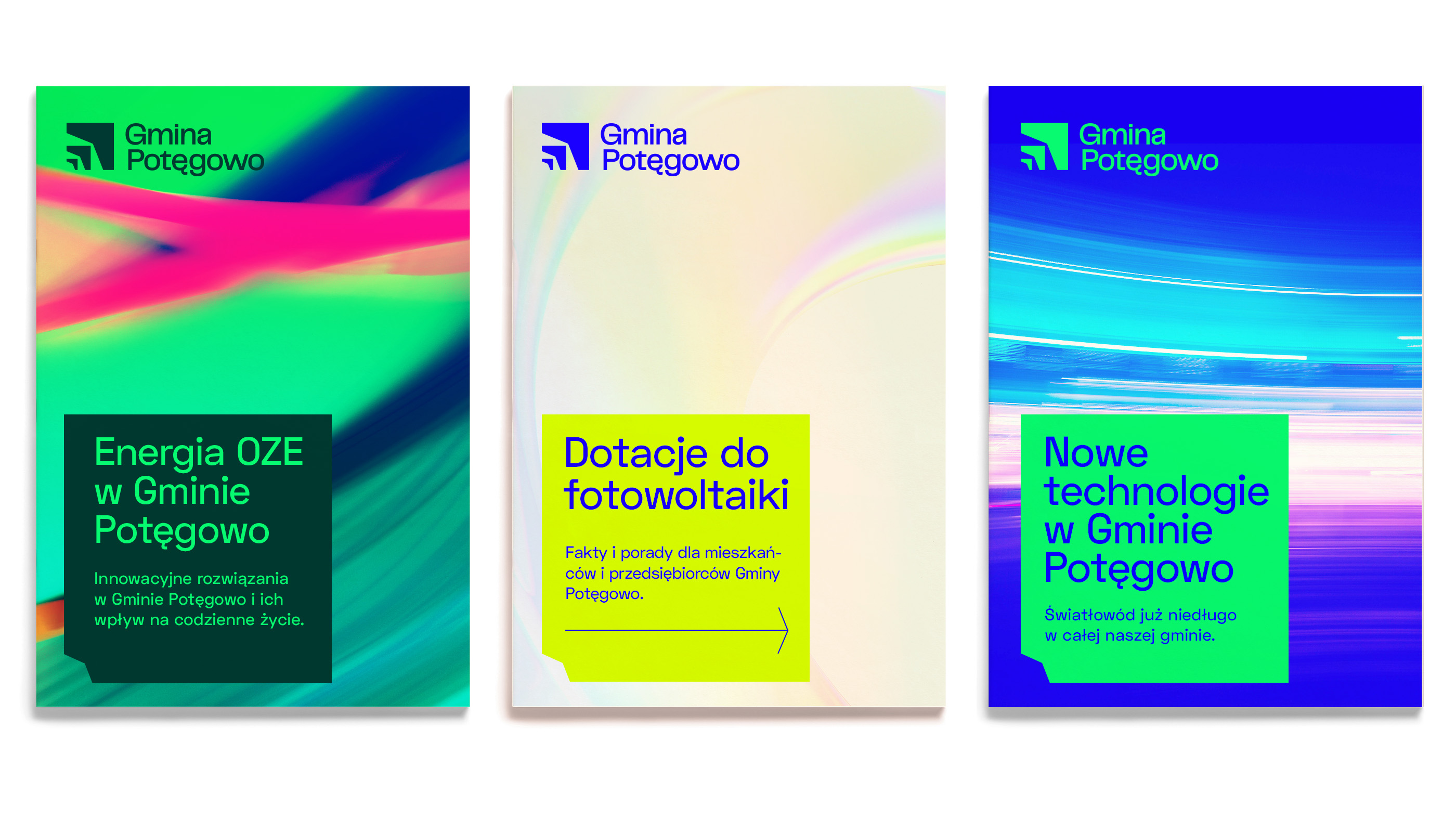
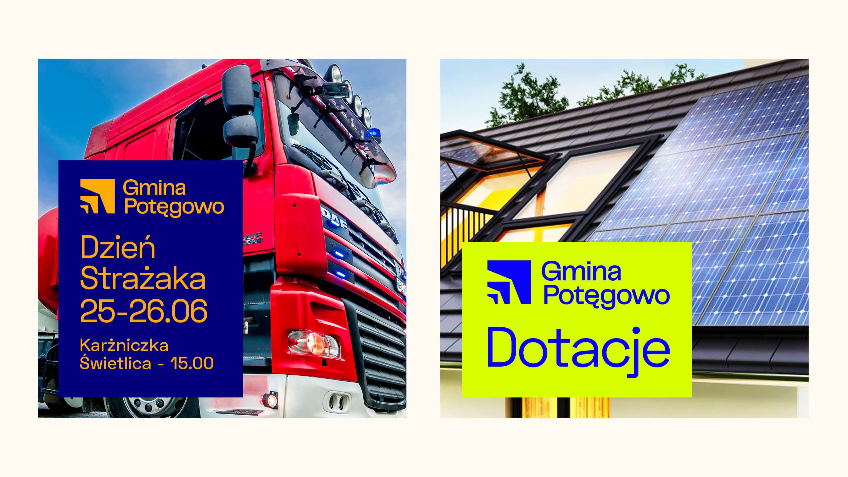
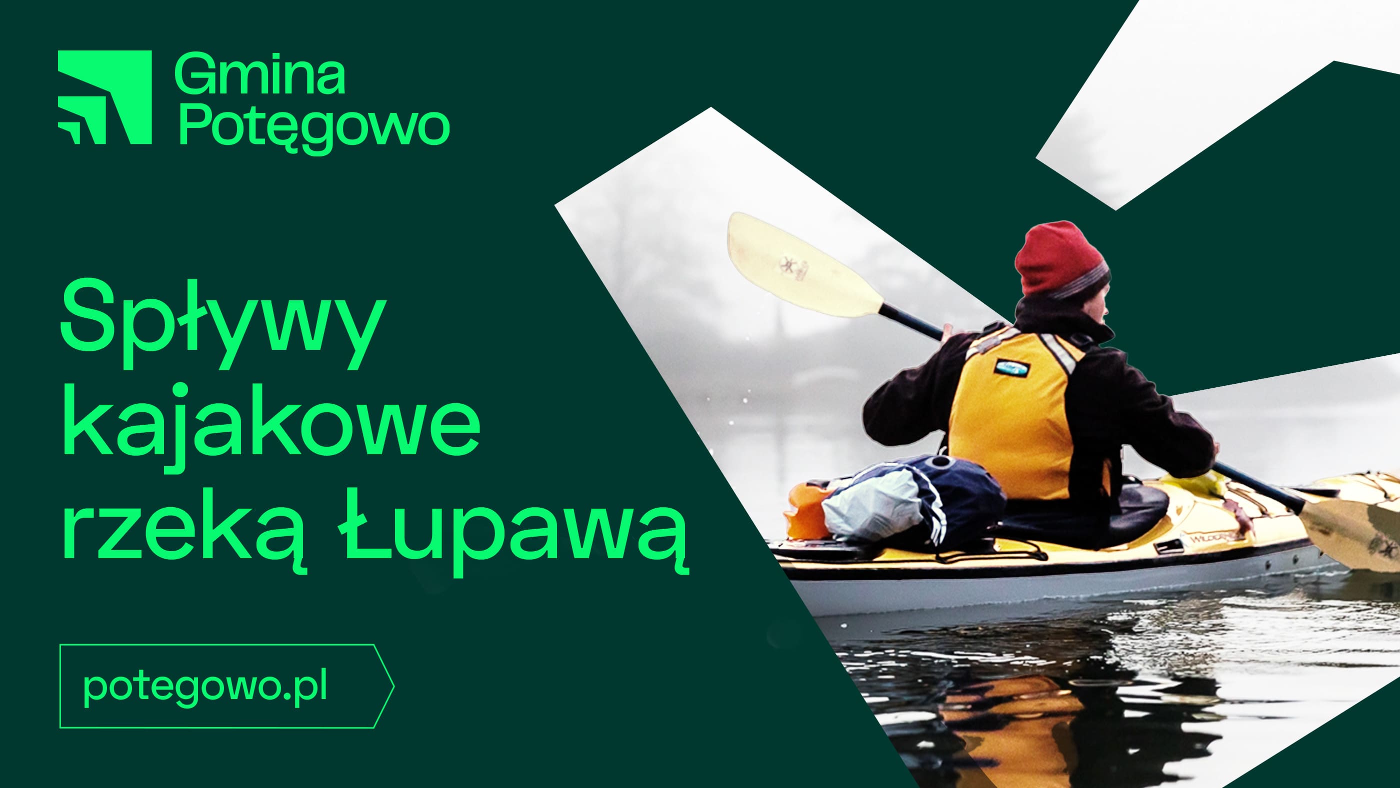
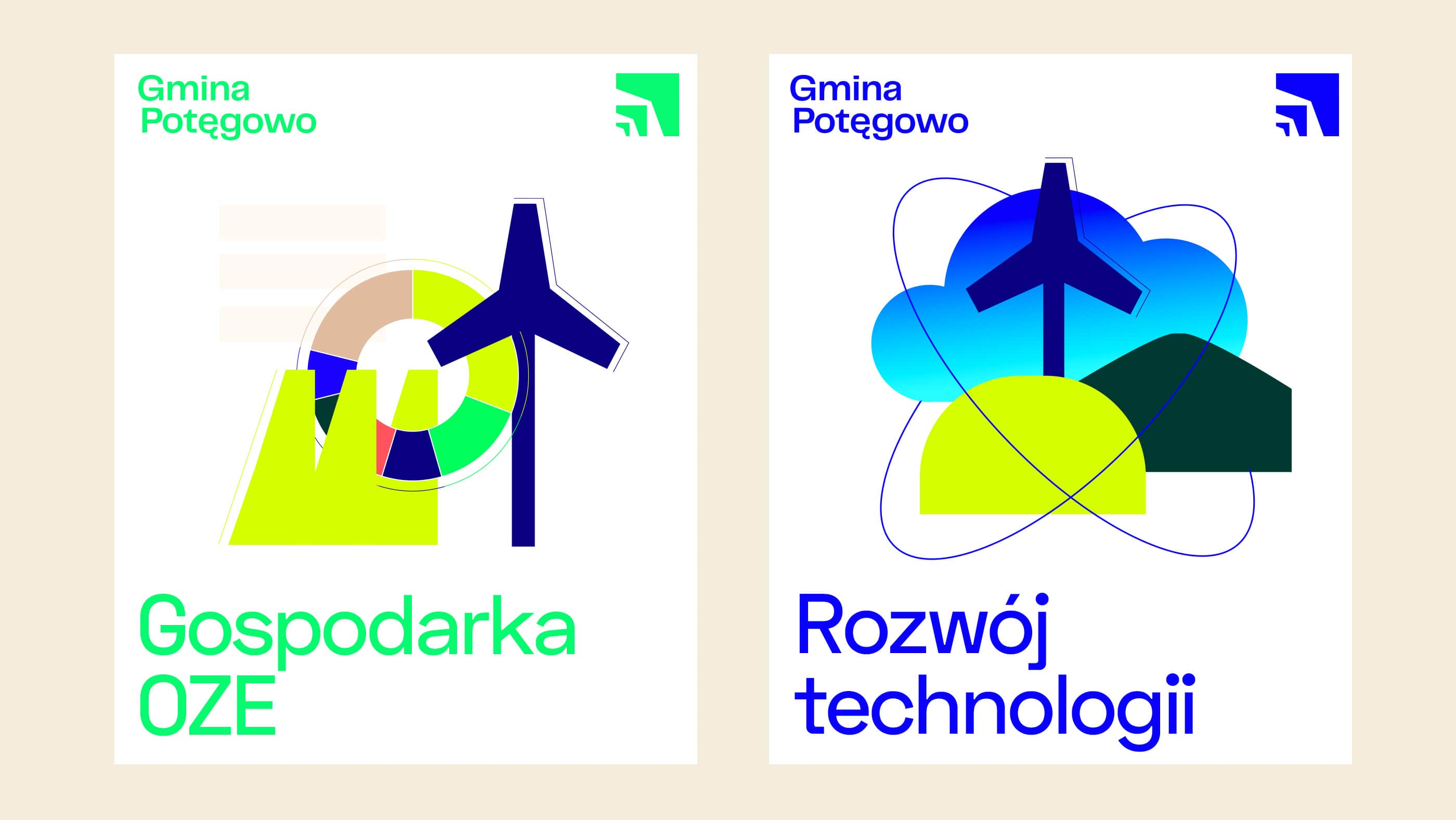
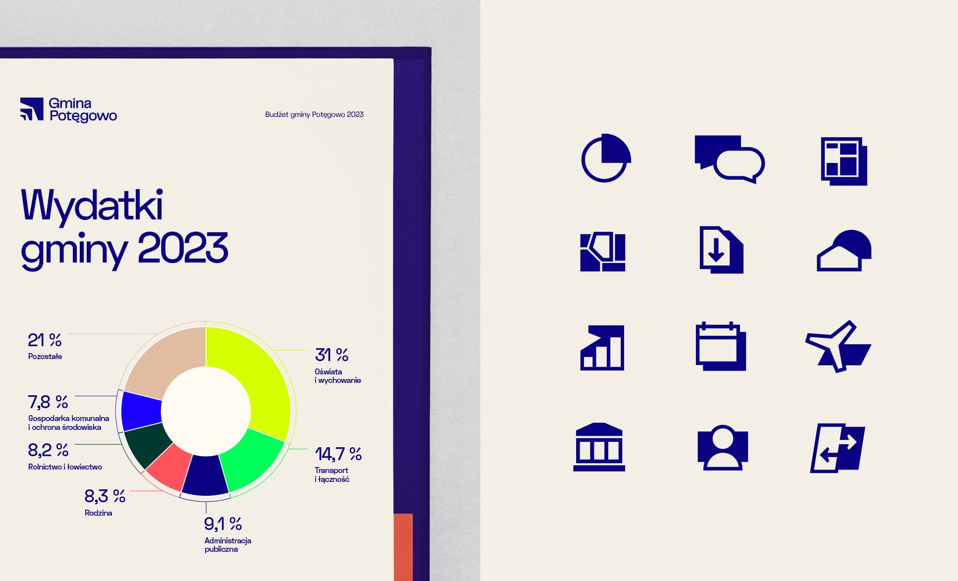
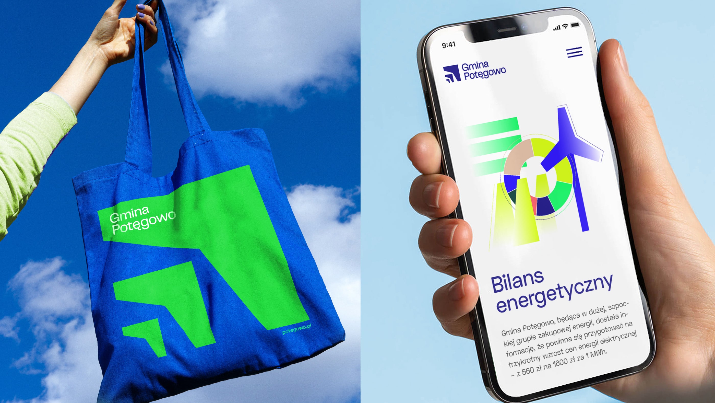
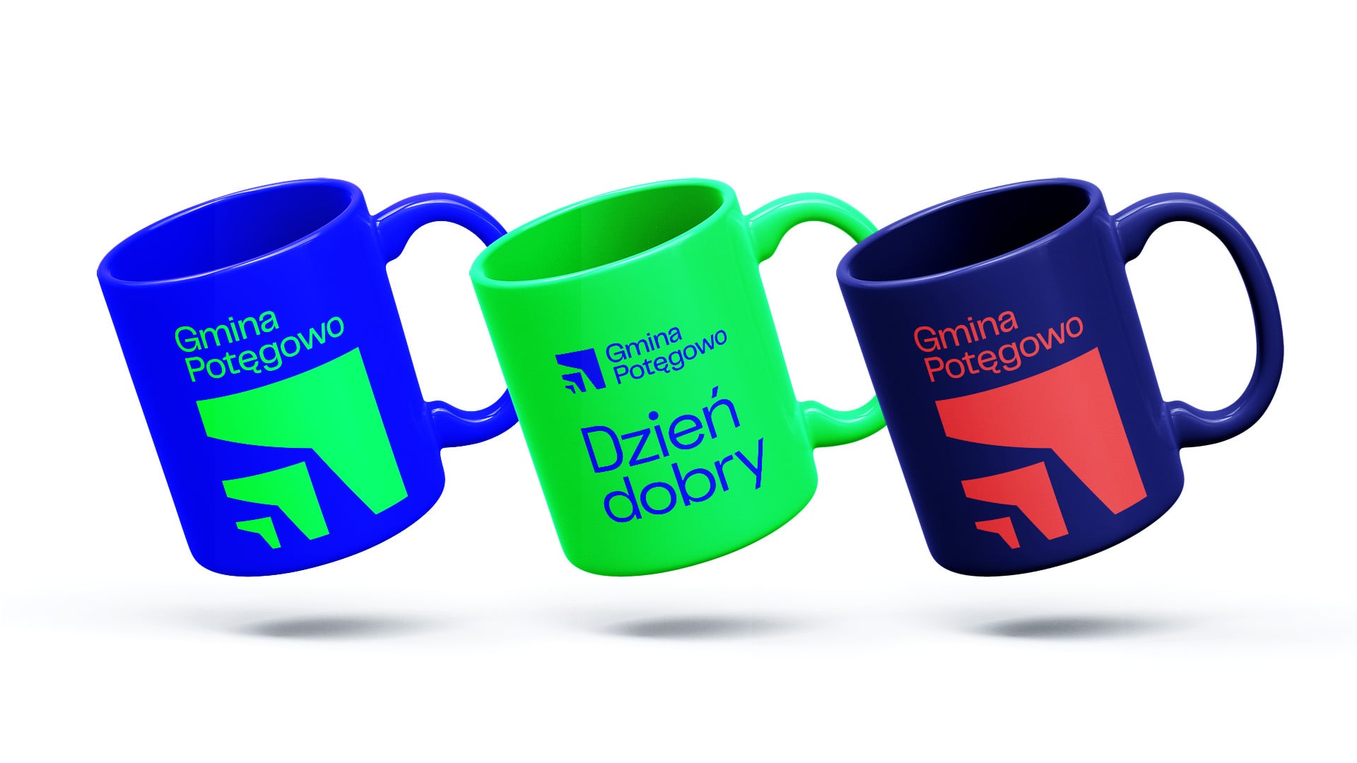
Power, potential and modernity are emphasized in the visual sphere. The new visual identity is bold, and stands out in the field of communication among local government units. The distinctive logo mark shows not only the power, but also the great development, tremendous progress and aspirations of the Municipality. The color scheme is also strong and different, almost like on the internet. When composing the palette, we took into account the “online” area, as this is also where much of the municipality's communication is focused. The various graphic solutions proposed make the possibilities for brand development almost limitless.
Power, potential and modernity are emphasized in the visual sphere. The new visual identity is bold, and stands out in the field of communication among local government units. The distinctive logo mark shows not only the power, but also the great development, tremendous progress and aspirations of the Municipality. The color scheme is also strong and different, almost like on the internet. When composing the palette, we took into account the “online” area, as this is also where much of the municipality's communication is focused. The various graphic solutions proposed make the possibilities for brand development almost limitless.
I welcome with great pleasure the results of the Rio Creativo team's work in developing our municipality's brand. The new visual identity perfectly highlights a solid, pioneering, innovative and striving for excellence municipality. The strong logo mark and different color scheme add character, manifesting power, potential and continuous development. For me, this is not only a brand, but also an expression of our aspirations and dynamism.
Dawid Litwin, Head of Potęgowo Commune
Brand strategy
Visual identity
--
2023
#TeamRio:
Marta Zarzycka
Marek Guziński
Izabela Bojanowska-Guz
Marcin Zgórski
Client:
Gmina Potęgowo
Wójt Dawid Litwin
Visual identity
--
2023
#TeamRio:
Marta Zarzycka
Marek Guziński
Izabela Bojanowska-Guz
Marcin Zgórski
Client:
Gmina Potęgowo
Wójt Dawid Litwin
With its new brand strategy and branding, Potęgowo Municipality presents itself not only as a leader in renewable energy, but also as a modern local government entity that is bold and future-oriented. This emphasized identity is designed to attract the attention of audiences, investors and partners who want to be part of this fast developing place. All this is the result of great awareness and confidence in the decisions of the municipal authorities, and the team responsible for the new vision. Thanks to the proposed solutions and assumptions of the strategy, building the identity of the place is natural for them.




back
top
Struggling with a brief?
Are there big challenges ahead for your organization? We can help you.
Talk to us.
Are there big challenges ahead for your organization? We can help you.
Talk to us.

+48 59 307 00 06
biuro@riocreativo.pl
biuro@riocreativo.pl
Rio Creativo Sp. z o.o.
Mickiewicza 26/2
76-200 Słupsk
Mickiewicza 26/2
76-200 Słupsk
#TeamRio
#SłupskaRobota
#SłupskaRobota
Rio Creativo © 2021

